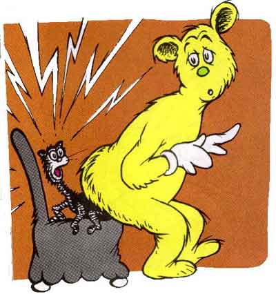




The art of Dr. Seuss is said to have 3 phases (Phillip 2004):
- The Early Style - from his ads and first books
- The Classic Style - developed in his more popular books
- The Later Style - irregular and uneven
We've seen the earlier style in Seuss' ads and political cartoons, but it is the Classic Style in his books that he is famous for. What about this art has made Seuss so popular and his books infamous?
Character Traits
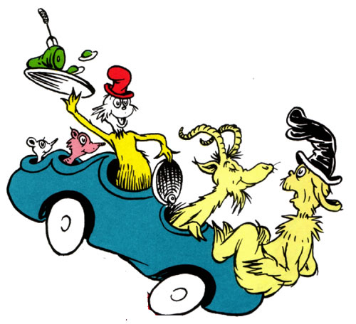
One of the most obvious things, throughout all Seuss books, is the traits of each character and how they all seem to look alike. Everyone, from the Cat in the Hat to Sam-I-Am has the big beady eyes with the little U-shape pupils. And both of these characters, and many others, have the big floppy hats that look different on every page, but are somehow the same. Every character is some sort of unknown animal with the furry collar, and the characterisitc fur that just has a different color. And most importantly, everyone is happy, even if they're angry or sad or scared, they are somehow still happy.
It is these traits that allow children to recognize the art in Seuss books. Somehow, this combination of unrealistic features and characters, has kept the interest of readers for decades.
Movement or Lack There Of
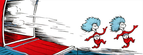
Another feature, that is very prevalent throughout the books, is the constant movement of scenes and characters. Seuss' drawing force you to follow his line, and go where he wants you to go. While it is most obvious in Green Eggs and Ham, movement is shown in every book, either through the lines that dash from behind a moving figure, or from the way characters are drawn mid-stride apparently running around. Characters are never stagnant in Seuss tales (Phillip 2004).
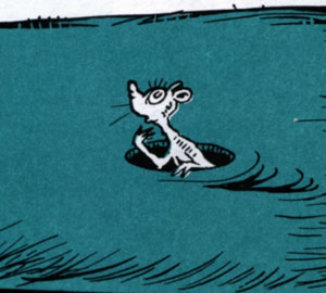
However, every story seems to have a stationary onlooker, who has little to no involvement in the story. This is typically a realistic animal, whether its the fish in the Cat in the Hat or the audience in If I Ran the Circus or the mouse in One Fish. They are often drawn with expressions, that mirror the readers reactions. This extra element to Seuss' stories is something that allows children to feel like they are a part of the action and are witnessing these extraordinary events firsthand (Phillip 2004).
Contrasts and Disconnects
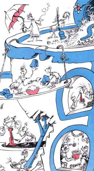
If there is one thing that Seuss is to be praised for, of all his artistic abilities, is his use of contrast. Throughout his books, he uses contrast to focus the attention of the children. As Seuss himself never seemed to grow up, it is not surprising that he understood the idea of an attention span. In order to get children to understand a story, Seuss would often draw pictures with a single character contrasted from the background or an incredibly complicated scene that leaves the attention up to reader. Books such as Hop on Pop show single images that connect to the words to assist with reading, while Horton Hears a Who has more complicated pictures that allow children's minds and eyes to wander while the story is read (Phillip 2004).
One of the most interesting ploys used by Dr. Seuss, is the concept of the disconnect. While typically words and art flow smoothly together, often times a word would be missing while it was drawn into the picture. For example, in the Cat in the Hat Seuss writes a list of all the things that the Cat can hold, but fails to mention the umbrella, which is so prominently placed in the scene. It is this contrast between words and images that provokes the imaginations of children, and gives Seuss' books their appeal.
Seuss was quoted to say, that he "used nonsense to awaken the brain cells" (Phillip 2004). By disecting his art, one can see that there is a structure to the nonsense, and while only three of the more important factors were touched on here, there are millions of reasons why Seuss' art has this effect on children. Most importantly however, Seuss' fame can be attributed to his goal of inspiring thought....
